Before You Redesign Your Website, Answer These 6 Questions
So you're ready for a new website.
You've been staring at the current one for months (years?), knowing it doesn't represent you or your expertise the way it should. So you're itching to dive in: pick a new template, choose some fresh colors, maybe finally use that font you've been eyeing on someone else's site.
Here's the thing, though. Many website redesigns fail — not because the design is bad, but because the thinking behind the site hasn't changed. You end up with something that looks different but works exactly the same. A fresh coat of paint on the same confusing structure.
The truth is that the most important work happens before you ever open your website builder. It's not picking colors or choosing templates. It's answering a handful of questions that will shape your website structure, your copy, and every design decision you make from that point forward.
I've been building websites for coaches, consultants, and professional speakers since 2018 (and building websites in general since 1995) and I can tell you that when someone comes to me frustrated with their expert website, the issue is usually that they’re thinking “what should my website look like?” when they haven't yet answered "what am I even trying to say?"
So before you redesign anything, answer these six questions. They'll take you maybe 15–20 minutes, and they'll save you weeks of going in circles.
1. What Do You Actually Sell?
Ok, I know, this may sound like a ridiculous question. Of course you know what you sell. But humor me for a second: Can you describe each of your offers in one or two plain-language sentences that someone who's never heard of you would understand?
I don’t mean your 60-second your elevator pitch or your clever branded program name. What is it, in normal words, prioritizing clarity over cleverness?
Consider the example of a financial planner who had three offers on her site. She referred to them as her "Clarity Package," her "Momentum Program," and her "Legacy Blueprint." They were meaningful names to her and her current clients. But to a brand new visitor they were total gibberish. Nobody knew what any of those things actually were.
When she translated them into plain language — retirement planning, investment management, and estate planning guidance — suddenly her site made sense to people landing on it for the first time. Same offers, same expertise, just, y’know, using words that humans use.
There's nothing wrong with branded program names, but you have to earn the right to use them. Until your target audience knows what you do, a clever name is just a roadblock between you and a potential client.
So start here: Write out what you sell in the simplest, most straightforward terms you can.
2. Who Is Each Offer For?
Your audience isn't one big, homogeneous group. Even if you serve a specific niche, different offers within your business might serve different segments of that niche, or the same person at different stages of their journey.
Getting specific about who each offer is for is what separates a website that converts visitors into clients from a website that confuses them into leaving.
You've probably seen (or — no judgment — had) a site that tries to speak to everyone. You know the type: "Solutions for professionals looking to achieve their full potential." What does that even mean? It's generalized to the point of meaninglessness.
When you know exactly who each offer serves, everything else gets easier. Your copy gets more specific. Your audience sees themselves in your messaging. And the people who aren't a fit will self-select out — which is actually a good thing, because it means the people who stick around are the ones most likely to become clients.
Here's what getting specific looks like in practice: Instead of "I help restaurants grow," a restaurant consultant might say "I help independently-owned restaurants in their first three years develop systems that keep them profitable." See how much clearer that is? A restaurant owner in year two reads that and thinks, that's me. A Fortune 500 executive reads it and moves on. Both outcomes are exactly what you want.
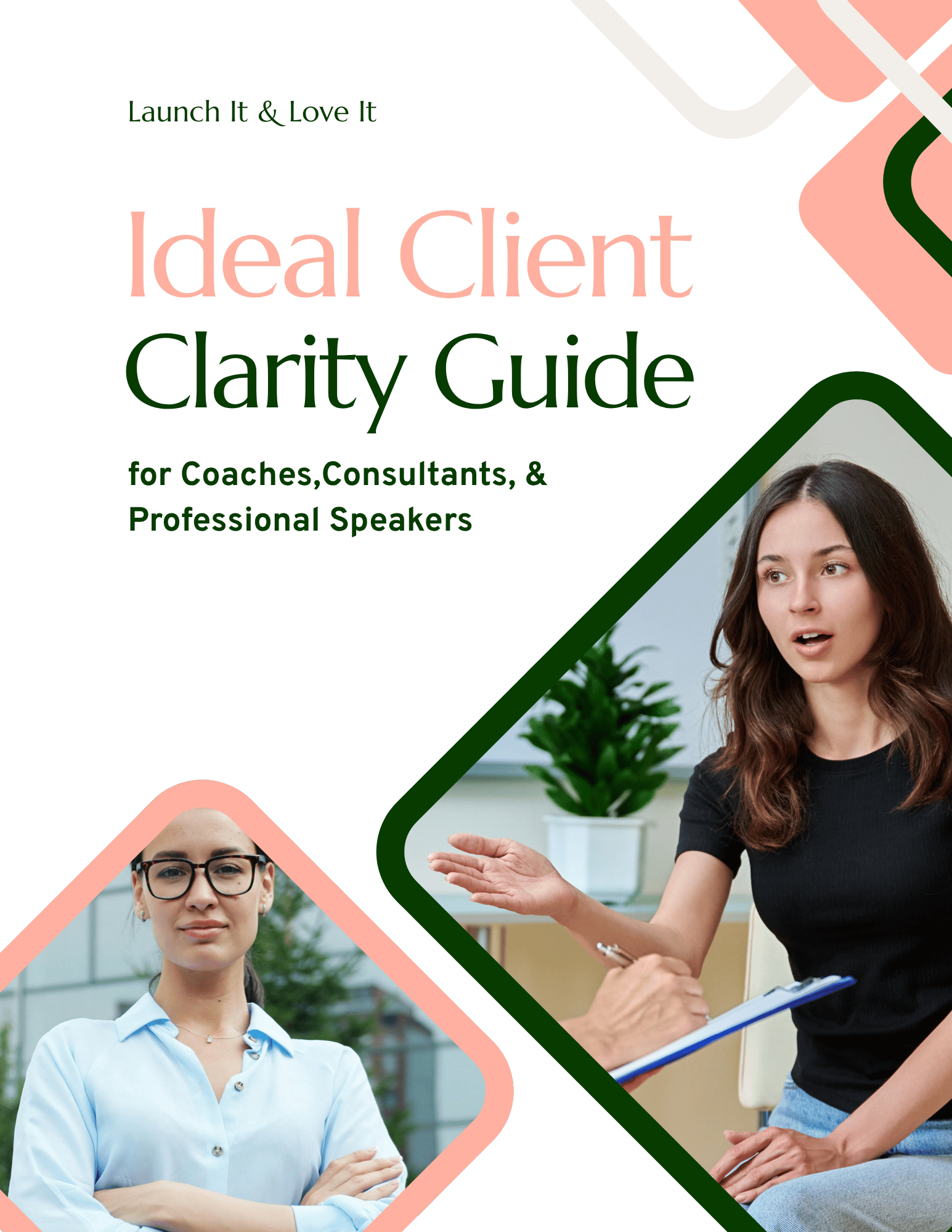
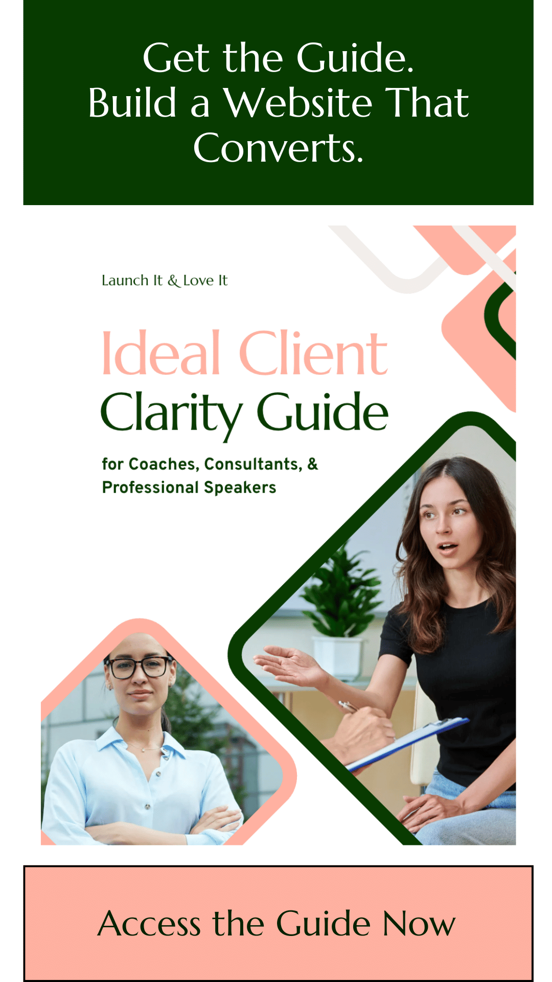
Want help getting clear on who your website should be talking to? I created the Ideal Client Clarity Guide — a short workbook that walks you through the questions you need to answer about your ideal audience. You fill it out from their perspective, in their words. By the end you've got a reference doc that makes writing your homepage, About page, and offer pages dramatically easier — because you actually know who you're writing to.
It's free, it takes about 15–20 minutes, and the clarity you get will shape every piece of marketing copy you write from that point forward.
3. What Outcomes Does Each Offer Deliver?
Here's where most expert websites go sideways. They spend all their website copy talking about what's included — the number of sessions, the length of each call, the bonus worksheets, the Slack channel access — and very little time talking about where the client actually ends up.
If I may shoehorn in a metaphor: Your audience cares less about the ingredients and more about the meal.
Think about it from your potential client's perspective. They're not lying awake at night thinking, "I really wish I had a six-session package with bi-weekly calls and a Voxer channel." They're lying awake thinking, "I wish I could stop dreading Monday mornings," or "I need to figure out how to get my team aligned before we lose another quarter."
Outcomes are the bridge between your audience's current frustration and the future they want. When you can name those outcomes clearly — not in vague, aspirational language, but in terms your audience actually uses — you're speaking directly to the thing that's going to make them click "Schedule a Call."
For each of your offers, write down the specific transformation or result your clients walk away with. Not what you do for them. What they get.
4. What's the Simple Process for Each Offer?
You're the expert. You've got a way of working with people that gets results. But when it comes to your website, you don't need to explain every step of that process in granular detail.
In fact, please, please don't.
What you need is a simplified version — ideally three steps — that paints a picture of how you take someone from where they are to where they want to be. The goal isn't to document your entire methodology; it's to show your audience that there's a clear, proven path they can follow.
Three steps. That's the sweet spot. Here's why: Three steps feel manageable. Three steps feel like you've got your act together. Three steps show your audience the way forward without overwhelming them with the 27 substeps that happen behind the scenes.
For example, a nutritionist might frame her process as:
Book a free assessment call so we can understand your goals
Follow your custom nutrition plan with weekly check-ins
Hit your health goals and feel amazing.
That's it. Clean, clear, and compelling.
Could she break step two down into fifteen smaller steps? Absolutely. Should she do that on her website? Absolutely not. Your website is a first date, not a marriage — you're trying to get someone interested enough to take the next step, not hand them the entire operations manual.
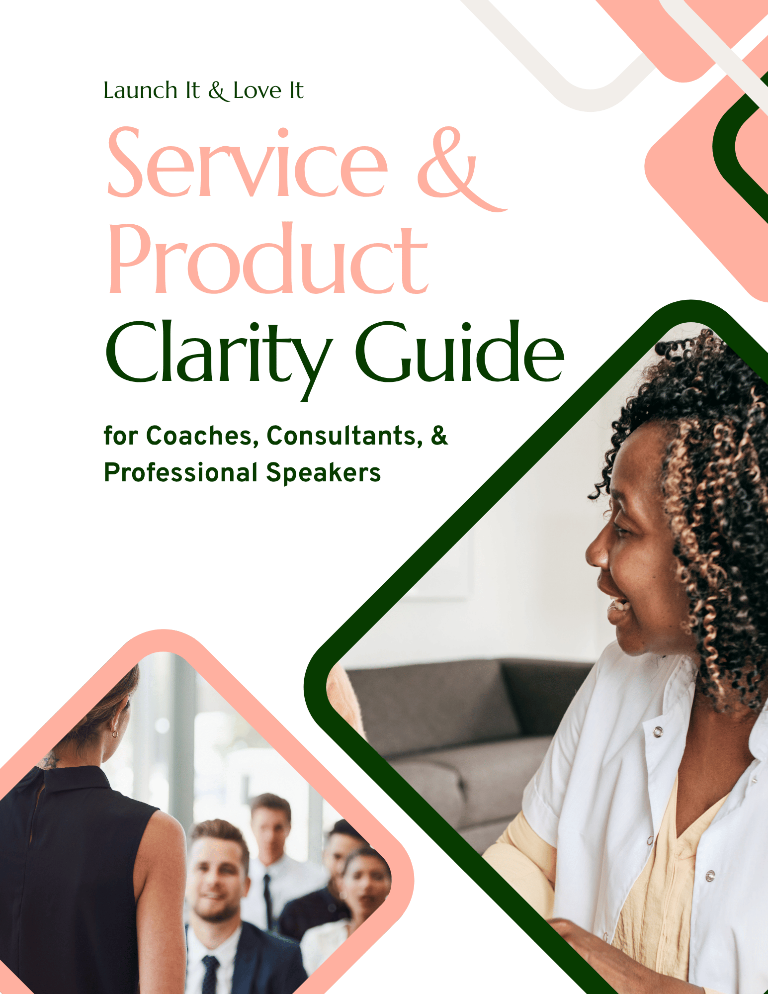
Looking for help clarifying your offers and processes? I created the Service and Product Clarity Guide — a short workbook that walks you through your offers so you can clearly convey them on your website. By the end you’ll have a reference doc you can use for your website and other marketing materials.
It's free, it takes about 15–20 minutes, and the clarity you get will shape every piece of marketing copy you write from that point forward.
5. How Many Offer Pages Do You Need?
This one trips people up more than you'd expect. If you offer multiple services or products, the question of "how many offer pages do I need on my website?" can feel paralyzing.
Here's a simple framework that works every time. For each of your offers, look at three things:
The audience it serves
The outcome it delivers
The process it follows
If two offers serve the same audience, deliver similar outcomes, and follow a similar process, they can probably share a page. If any one of those three things is significantly different? That offer probably deserves its own page.
Let me give you a quick example. Say you're an interior designer who offers both full-home redesigns and single-room refreshes.
Same audience (homeowners who want a beautiful space)
Similar outcomes (a room or home they love)
Similar process (consultation, design plan, execution).
Those can live together on one "Design Services" page, easy.
But now let's say you also offer a weekend staging service for realtors preparing homes for sale.
Different audience (realtors, not homeowners)
Different outcome (a faster sale, not a dream living room)
Different process (a quick weekend turnaround, not an extended design engagement).
That deserves its own page.
The point isn't to have as many pages as possible or as few as possible. It's to organize your offers in a way that makes sense to someone encountering your business for the first time. If your audience has to do mental gymnastics to figure out which of your services is right for them, you've lost them.
6. What's the Next Step You Want Visitors to Take?
Every page on your site should have a job. And every job should end with a clear next step for your visitor.
Before you redesign, you need to know what that next step is for each page. Is it booking a discovery call? Downloading a free resource? Clicking through to learn more about a specific offer? Signing up for your email list?
If you don't know what you want someone to do on a given page, your website definitely won't know — and neither will your visitor. They'll just leave, which is a shame, because they came to your site for a reason, and you had an opportunity to turn their interest into action.
Here's the thing about calls-to-action: You really can't overdo them. I know it feels pushy or salesy to pepper your pages with buttons and invitations. But the people who aren't ready to take the next step in your sales process will simply gloss over them, while the people who are ready will get exactly the nudge they need. You're not being pushy — you're being helpful.
And remember: not every next step has to be "buy from me right now."
Someone at the top of your funnel might just need a link to a related blog post.
Someone in the middle might be ready to download a free resource and join your email list.
Someone at the bottom might be ready to book that call. The key is knowing which next step fits each page and making it obvious.
The Hard Part Is Done
Here's what I want you to take away from this: Answering these six questions is the hard part of a website redesign. Seriously. Whether you're a coach, consultant, or professional speaker, once you've done this thinking, the actual building becomes dramatically easier. You're not staring at a blank canvas wondering where to start — you're filling in a framework with answers you've already worked out.
Your pages: You know what they are.
Your copy: You know what it needs to say.
Your calls-to-action: You know where they're pointing.
The design and template and fonts and colors: Well those are the fun part, and you've earned them.
If you're ready to take these answers and turn them into an actual website, that's exactly what Launch It & Love It template kits are designed to do. Shop Templates Here.

Hi, I'm David!
I've poured my 15+ years professional web design and marketing experience into creating website templates and guided lessons designed to help thought leaders (coaches, consultants, professional speakers) get the website they've always wished they had.