The 7 Characteristics of a Great Website for your Coaching, Consulting, or Speaking Business
In a perfect world, we’d all love to have a great website. But there are obstacles: We’re not web designers by trade, we’re busy actually doing the work we do in our businesses, we don’t have the money or time to invest right now.
And so our website improvements become a someday item, left to simmer on the back burner until it’s all out of steam.
I created Launch It & Love It (and it’s accompanying framework, the Launch Framework) as a means to solve this problem.
I know that you can create a great website without an overwhelming time or financial investment, so it can have a place on the front burner without disrupting your normal flow.
But what constitutes a “great” website, anyway? I’m glad you asked.
There are seven key elements to a great website:
A great website shows (rather than tells) your target audience what it’s like to work with you.
A great website is about your audience, not you.
A great website guides your audience in a way that's easy to follow...
...While offering them agency in how they consume your content.
A great website clearly & concisely outlines your offers and process using just enough information for your audience to take the next step...
...And makes it clear what that next step is, inviting your audience to take it.
A great website acts as an employee and ambassador for your business.
1. A Great Website Shows (Rather than Tells) Your Target Audience What It’s Like to Work with You.
I come from a Customer Experience background, and one of the most common mistakes I see is practitioners planning out the customer experience starting when someone becomes a customer (it’s right there in the name, right?).
In truth, your customer experience begins long before someone becomes a customer -- and the success or failure of that customer experience is a major driver of whether or not someone becomes a customer at all.
In many cases, the first meaningful interaction somebody has with your brand is experiencing your website. (Sure, they may see your posts on social media, but your website is where they go to decide if they want to work with you.) And they’re usually coming in with some degree of doubt: You’re asking them to invest their money and energy in working with you (as are others, on their websites); there are obstacles to overcome before someone is ready to work with you.
When someone interacts with your site, they’re learning what it’s like to work with you. If the process is clear, easy, even enjoyable, then your potential client or customer is learning that to work with you is clear, easy, and even enjoyable. If the process is confusing, frustrating, and a general slog, well, you can imagine what you’re showing your audience it will be like to work with you.
This is what I mean when I say a great website shows, not tells what it’s like to work with you. Anybody can talk about how great they are. Possessing a long list of achievements and experience is not enough to set you apart; it’s merely what gets you a seat at the table.
You already know that one of the key things that sets you apart is the way you work with your clients. Your website, when done well, should demonstrate this.
How? Well, here are a few ideas:
If you have a sense of humor and play in your work, don’t be afraid to include some humor and play in your written website copy.
If you’re known for making things easy for your clients but giving them great plans and frameworks to follow, introduce your offers in a way that’s similarly organized and clear.
If you’re a great cheerleader for your clients, use uplifting and empowering messaging across your site to inspire your audience.
Ultimately the experience of your website should match the experience of working with you. When it goes right, so much of the doubt your audience comes in with will melt away, turning into confidence and excitement at the prospect of working with you.
2. A Great Website is About Your Audience, Not You
It’s your website, it’s only natural to believe you should be using it to talk about yourself. We feel compelled to list our accomplishments, go into detail about our backgrounds, and explain at length how we help.
But that’s not actually what your audience is interested in.
Your audience wants to know about you only so far as it’s relevant to how you can solve their problems and help them reach their goals. The rest of it is noise.
My friend Gini Dietrich calls this taking the French out of your content (as in, getting rid of the “Oui, oui, oui”). For us solopreneurs, it might me more appropriate to say we’re removing the Spanish from our copy (as in, getting rid of the “mì, mì, mì).
If you’d prefer to be less cute and more to the point: Don’t fill up your whole website with words about how great you are.
Michael Hyatt calls this positioning yourself as the guide, not the hero. Each individual in your audience is the hero of their own story. They’re not looking for another hero -- they’re looking for someone who can guide them with their expertise and give them a pathway to achieving their goal. You’re the Yoda to their Luke.
It’s important to note: I’m not telling you not to say nice things about yourself. By all means, list your achievements, differentiators, and philosophy. But as you do so, keep checking yourself: ”Is this relevant to my audience? Is it about them, and helping them achieve their goals?”
If so: You’re on the right track, baby.
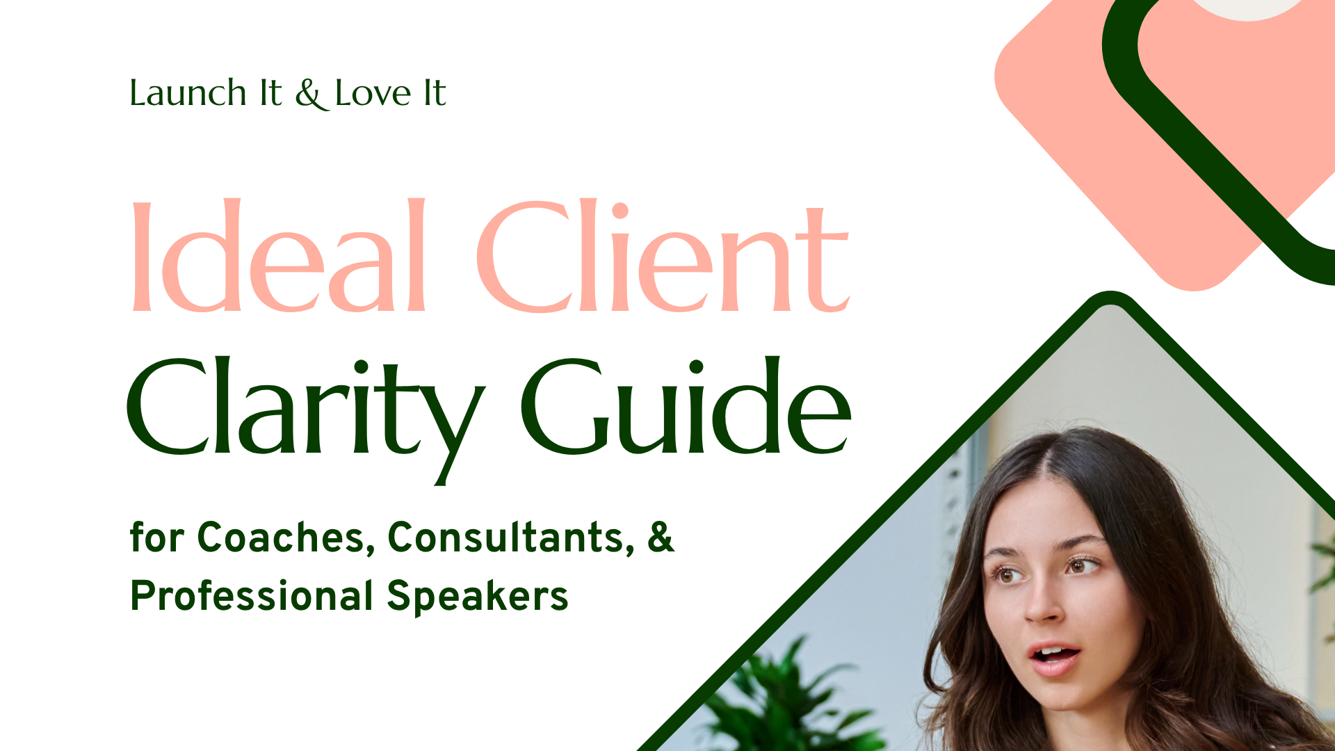
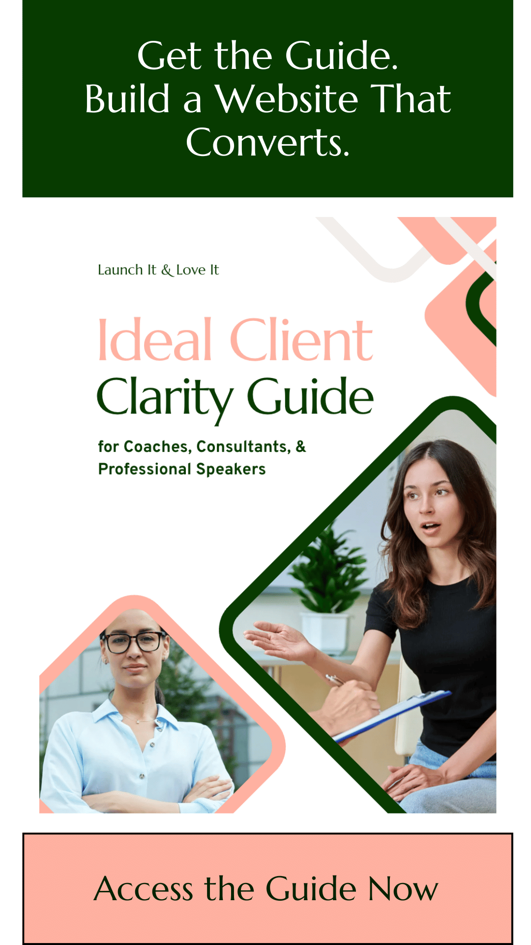
Want help getting clear on who your website should be talking to?
Get the Ideal Client Clarity Guide — a short workbook that walks you through the questions you need to answer about your ideal audience.
3. A Great Website Guides Your Audience in a Way That’s Easy to Follow
When it comes to guiding your audience through your site in a way that’s easy to follow, there are two key areas of focus: Your navigation, and your content flow.
Navigation
Since navigation is right at the top of each page, let’s tackle it first. Whatever pages you decide to include on your site, those should be linked in the navigation using word that are relevant and meaningful to your audience.
Here’s a mistake I see: Julie offers three types of coaching: Single sessions, group coaching, and ongoing coaching with a minimum 6-month commitment. Each of these offers have their own page on her website. And what do the navigation links on said website say?
QuickStart Coaching
NextLevel Coaching
BestSelf Coaching
Julie (and her current clients) know that QuickStart Coaching is the name of her single sessions, NextLevel Coaching is her group offer, and BestSelf is her 6-month offer.
The problem is new audiences have no idea what these terms mean. Potential clients are left to do extra work to figure out what the heck you’re talking about. And remember characteristic of a great #1? In this case, Julie is showing her audience that working with her is going to be a confusing, frustrating experience.
Sometimes in our rush to differentiate ourselves through branding, we obscure what it is we actually do and create roadblocks between us and our potential clients. There’s nothing inherently wrong with coming up with a pithy term to refer each of your offers, but until you’ve educated your audience as to what a term means, you haven’t earned the right to use it and expect anything but confusion from your audience.
Here’s what Julie’s navigation ought to say:
Single Coaching Sessions
Group Coaching
Long-Term Coaching
Is it sexy? Well, in the sense that it’s clear, direct, and empowers your website’s visitors... yes, it is sexy, actually.
Content Flow
Now let’s talk about website content flow.
Your content should flow in a way that anticipates what your audience wants to know and delivers that in a way that’s easy for them to access.
Typically when a someone visits your website, they’re looking for something. The quicker they can find that thing -- and with the least resistance as possible -- the better experience they’re going to have. And the better experience they have, the better impression you’re making, and the more likely they are to become a paying customer.
To accomplish this in your own site, first you must understand your audience (or audiences).
For example, if you’re a professional speaker, one of your audiences is event professionals in charge of booking. What do event professionals come to your site looking for? Typically they’re looking for a speaker reel, a list of your popular keynotes with key audience takeaways, and maybe some proof points (certifications, testimonials, places you’ve spoken before).
Once you know what your audience is looking for, the next step is to serve it up to them.
For the example above I’d recommend a speaking page (navigation title: Speaking) with everything event professionals are looking for near the top of the page and presented in a logical order.
“But I have multiple audiences,” you might say, “Or segments of folks within my audience looking for different things.”
That’s okay. That’s almost always the case, and no reason to fear. We’ll tackle this issue in the next point, starting... now.
4. A Great Website Offers Your Audience Agency in How They Consume Your Content.
So your audience is not a monolith. It’s made up of different people looking for different things in different orders... and that’s okay. It just means we have to design for the real world.
The most common way -- and wrong way -- to address this is to get general: To try and make your website everything to everyone.
You’ve seen the terrible results of this approach before: When you go to a site that offers “solutions” for “humans” looking to “up their game.” What does this even mean? It’s generalized to the point of meaninglessness.
The correct solution is to create multiple paths that your different audiences can follow, like a Choose Your Own Adventure book:
Do you choose to learn more about consulting packages? Click here.
Do you choose to learn more about keynotes? Click here.
Do you choose choose to try to walk through the quicksand? Click here. (Side note: Never try to walk through the quicksand.)
Your homepage is like the core transfer station here, making all the paths clear and clearly indicating how to explore any of those paths on a deeper level. We’re effectively asking our audience to identify themselves so we can serve up the most relevant content. I’ve seen this so explicitly laid out that a homepage literally had boxes:
I am an individual looking for help with my financial planning
I am an event professional interested in booking a speaker
I am a member of the media interested in an interview
...where clicking on any box leads to the relevant page.
Even if you choose a more subtle approach, the directive should be clear: “This is something we can talk about. If you want to learn more about it, click here. If it’s not relevant, here’s something else we can talk about...” And so on.
How do you know what options to offer? By knowing your audience (or, often, audiences). This is where your level of experience really becomes a boon for you: anyone with an internet connection can make a pretty website, but only someone like you can speak to your audiences in a way that communicates that you understand them. Use that to your advantage.
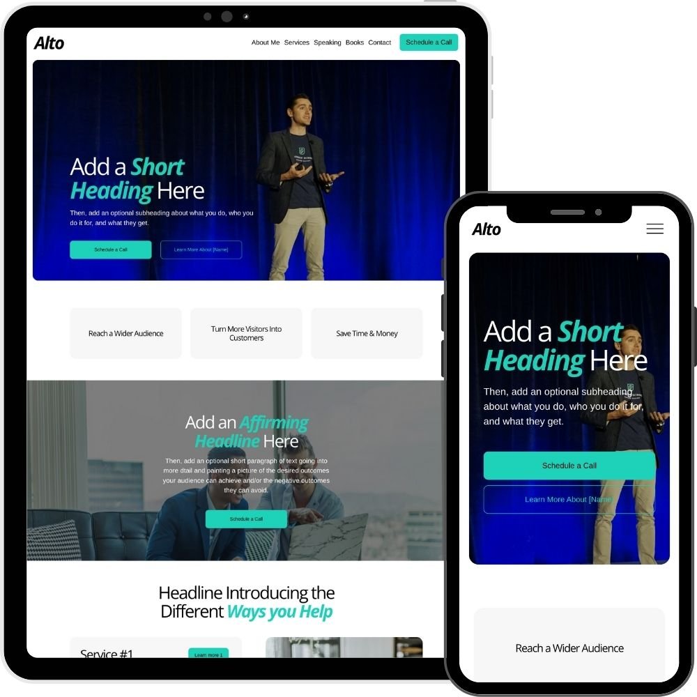
Designed especially for Professional Speakers, the Alto is a beautiful, fully responsive template designed for Squarespace 7.1.
Alto is more than just a template. You’ll also get exclusive tutorials and simple workbooks designed to help you launch a site you love in a matter of days — without investing thousands of dollars or dozens of hours.
All Launch It & Love It templates are build by David Kent Hornreich, a web designer and marketer with 7+ years experience helping Coaches, Consultants, & Professional speakers to get more from their websites to book more gigs and reach a wider audience.
5. A Great Website Clearly & Concisely Outlines your Offers and Process Using Just Enough Information for Your Audience to Take the Next Step...
There are three key parts to this item:
Clearly outlining your offers
Clearly outlining your process
Providing just enough information for your audience to take the next step.
Let’s tackle these in order.
Clearly Outlining Your Offer:
How many people will buy from you if they don’t understand what you sell? Exactly zero. Think about it: When’s the last time you said “I’m not sure I understand what this is, but I’ll buy it and then figure it out?” (I’ve done this once, at a grocery store, with a durian fruit. I ended up eating a couple bites, thinking “this isn’t as gross as it smells,” and tossing the rest before it stunk up my kitchen.)
We talked earlier about making your offer names easy to understand -- remember: Group Coaching, not NextLevel Coaching -- and this carries through to how we describe our offers, too.
When we talk about our offers, our audience is itching to know:
What it is: What are the practical details? What’s included?
Who it’s for: Is this for a niche audience (hopefully yes, it’ll be easier to sell) or a general audience?
What they get: What outcomes will be reached?
In all of these cases, your audience is wondering: “Does this align with what I’m looking for?”
The number one answer you want people to arrive at is a resounding Yes. If not that, then the answer you want people to arrive at is a resounding no.
Wait... what? Why?
It goes back to the mistake of getting general to try and be everything to everyone. When we go general, we lose our target audience without really gaining anyone from a more general audience. We just become more forgettable.
Imagine for a moment you need help with a hip ailment. Would you rather go to a General Practitioner, or a Hip Specialist?
Whatever problem you solve, your audience is looking for a specialist.
Clearly outlining your process
Your audience is also looking for someone with a plan.
Imagine this scenario: You go to said hip specialist, ask what should be done to fix your issue, and they say: “Well, what would you like us to do?” Likely your answer is that you’d like them to provide you with a plan since they’re the supposed experts.
So be the expert. Have a plan. Explain your process to your audience in as simple of terms and in as few steps as possible to make it easy to digest. A few simple steps will do.
This doesn’t mean you can’t be flexible. It doesn’t mean you can’t work collaboratively with your clients to create plans that are customized to their needs. But you’ve got to show that you have a proven process that works.
Providing just enough information for your audience to take the next step
Conciseness is key. Whether you’re talking about your offer or your process, it’s easy to want to go into great detail. I implore you to resist the urge.
Sure, maybe a successful client will need to know every last detail about your offer and process by the time they’re done working with you, but not yet.
Think of your website as a first date. You’re grabbing a cup of coffee and finding out if you might be a fit for one another. You’re learning about each other in broad strokes. What kind of hobbies do you have? What’s your family like? Are you definitely not a serial killer?
Going into too much detail is overwhelming. When we present our audience with too much information, the important stuff gets drowned out by noise. Don’t let your important messaging get drowned out by noise.
Your website is one touchpoint in your sales and deliver process. You probably have some sort of “getting to know you call” where you assess fit -- that’s a great time to go into a more detail. If you end up working together, that’s a wonderful time to go into every last (relevant) detail.
But your website’s goal is just to get them to that next logical step. Provide the information necessary to get them there and there only. Speaking of next logical steps…
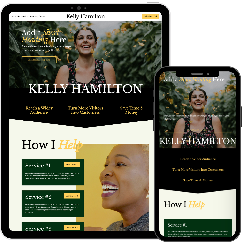
Designed especially for Coaches & Consultants, Kelly is a beautiful, fully responsive template designed for Squarespace 7.1.
And Kelly is more than just a template. You’ll also get exclusive tutorials and simple workbooks designed to help you launch a site you love in a matter of days — without investing thousands of dollars or dozens of hours.
All Launch It & Love It templates are build by David Kent Hornreich, a web designer and marketer with 7+ years experience helping Coaches, Consultants, & Professional speakers to get more from their websites to book more gigs and reach a wider audience.
6. A Great Website Makes it Clear What the Next Step Is & Invites Your Audience to Take It.
Every page on your site should have at least one (sometimes two) next step that you want your audience to take. Whatever the page and next step, a great website makes it obvious what that next step is, and uses Calls-to-Action (CTAs) to direct your visitors to take that next step.
CTAs are so powerful that according to go to the website WiserNotify, a clear CTA can in crease conversion rates by 161%.
Examples of logical next steps and their CTAs include:
On a home page: Learn more about a particular offer (with a link to that offer’s dedicated page)
On a offer page: Schedule a free fit call (with a link to your scheduling tool)
On a blog post: Download a free resource, opting into marketing emails (with a signup form or link to your resource landing page)
Where should CTAs go on each page? As a general rule, it’s really hard to overuse CTAs. Use them early, use them often. Don’t worry about being overly pushy or salesy -- those who aren’t interested will gloss over them, and those who are interested will get exactly the gentle push they need to take action.
7. A Great Website Acts as an Employee and Ambassador for Your Business.
What do I mean, here? Obviously your website isn’t sentient (AI hasn’t gone that far... yet) so how is it supposed to act as an employee and ambassador?
What I really mean is that I want you to think bigger about what your website can do for you and your business. Too many folks think small when it comes to their website: “I just want somewhere to send people so they know I’m real,” people tell me. Or, “I just want a basic brochure site.”
But a website is an investment of your time, energy, and money. Shouldn’t it have a significant return?
So imagine you had an employee on your sales team. What would make them a great employee and ambassador of your business?
Well, they’d establish a positive customer experience from the outset, demonstrating how easy it is to work with you.
They’d act as an advocate for your customer, listening to their needs and guiding them toward your offers that are most appropriate for them.
They’d give each potential customer a plan of action so they could move forward confidently, knowing what to say (and what not to say) to get the message across.
And they wouldn’t be afraid to ask for the sale at the right time.
I’ve just described characteristics 1 through 6 of a great website.
This is why I want you to think bigger about what your website can be. Yes, it can lay the groundwork for more sales. Yes, it can convert more visitors into subscribers and customers and clients. Yes, it can justify the necessary investment in it by paying for itself hundreds of times over.
You just have to decide that’s the kind of website you want. The kind of site that goes to bat for you. The kind of website that’s considerate of your customers. The kind of website that tells your story the right way.
If your website isn’t doing this for you, you’ve got a problem. But you’ve also got an opportunity to make a significant, meaningful change in your business.
And if this all feels overwhelming, don’t fret -- creating a website like I’ve described here is exactly what the Launch It & Love It and the Launch Framework are about. We can do this without the overwhelm, in a long weekend, not weeks or months. And we can do it ourselves.

Get the Color Theory Quick Guide