How to Choose Colors for Your Website Using Your Brand Identity
Table of Contents
Color Convey Feelings. What Feelings Do You Want to Communicate?
When building our Visual Identity, it can be tempting to simply choose our favorite colors. But our favorite colors won’t necessarily serve our business the way we hope.
When we think about choosing colors for our brand, we have two big goals in mind:
We want our colors to serve as a “visual shorthand” for our Brand Personality.
We want our colors to be in line with our Audience’s expectation, so they know they’re in the right place.
How Many Colors Should You Pick?
It can be tempting to throw every color of the rainbow into your design, but oftentimes that can be overwhelming.
When it comes to picking colors, start with a Core Color.
A Core Color is the color you’ll use for elements you want to draw your audience’s eyes to. This includes things like your Call-to-Action buttons, headings, and links.
Beyond your core color, you can choose one to two secondary colors that are relatively neutral and support your core color.
Once you’ve picked your core color, consider harmonizing your secondary colors one of these ways:
Monochromatic
A monochromatic color palette uses variations of shades of a single color. Take your core color, then lighten and darken it to find your palette.

A monochromatic color palette based on a core color of coral.
Analogous
An analogous color palette uses colors that are next to each other on the color palette. Start with your core color, then explore shades of the adjacent colors on the color wheel.

An analogous color palette that starts with an icy blue core color, then includes secondary colors that incorporate nearby green and teal.
Complementary
A complementary color palette uses colors opposite of one another on the color wheel. Begin with your core color, then go to the opposite side of the color wheel to find your complementary color.

A complementary color palette starting with a bold orange, supplemented with variations of blue.
Other Color Harmony Methods
There are additional color harmony methods out there, including Triadic and Quadratic (using 3 and 4 colors, respectively, spread evenly across the color wheel) and more.
I don’t recommend using these for your website, though — they can become overwhelming or distracting to the eye, making it unclear for your visitors where they should be looking and what to pay attention to.

Get the Color Theory Quick Guide
What do Different Colors Represent?
Let’s go through the rainbow and beyond, looking the feelings that different colors and shades can convey.
Remember, you’ll want to choose colors that align with your Brand Personality and your audience’s expectation.
Alright, let’s dive in!
Red is often Bold

One thing you can’t deny about the color red: it stand out.
When combined with bright colors, it can feel playful and fun.
Or when used as the only color and an otherwise black and white color palette, it can convey bold luxury.
Positive Associations:
Love & Passion
Power
Confidence
Vitality & Health
Excitement
Negative Associations:
Danger & Warning
Anger
Financial Loss
Pink can be Playful
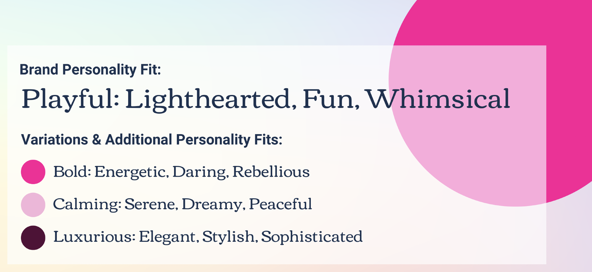
Pink can evoke feminine energy* like no other color (just ask Barbie!).
In its brightest form, it’s both playful and bold. Play with pink’s saturation to evoke vastly different moods.
*Fun Fact! In Japan, pink is considered a masculine color. What a great reminder that color is subjective and influenced by culture!
Positive Associations:
Love & Tenderness
Femininity
Hope & Optimism
Calmness & Kindness
Fun
Negative Associations:
Shallowness
Childishness
May alienate some men
Orange Can Come Across as Caring

Positive Associations:
Energy & Excitement
Creativity
Happiness & Optimism
Adventure
Warmth
Negative Associations:
Immaturity
Deceit
Caution or Warning
Can be Overwhelming
Yellow Tends to be Creative

Yellow is a great color for conveying energy, creativity, and confidence.
Lighter variations can be calming, while darker variations can take on a gold or bronze effect that can communicate luxury.
Positive Associations:
Optimism
Creativity
Intellect & Clarity
Energy & Warmth
Negative Associations:
Anxiety
Deception
Illness
Frustration
Can be Overwhelming
Being Green May Not be Easy, But it Conveys Competence

Green tends to communicate logic and reliability, and is an obvious choice for anything related to nature or environmental causes.
It’s association with money can be a positive (related to earnings) or negative (related to costs).
Positive Associations:
Nature & Environment
Balance & Harmony
Security
Problem Solving
Leadership
Negative Associations:
Illness
Greed
Envy
Selfishness
Blue Builds Trust

There’s a reason so many companies use the color Blue: It communicates dependability, trust, and competence -- the qualities we tend to be thinking of when we say we want our brand to be “professional.”
The downside, besides its frequency of use, is that alone it can come off as cold, clinical, and a little distant.
Positive Associations:
Responsibility
Trust
Productivity
Focus
Relaxation
Friendliness
Negative Associations:
Sadness
Coldness
Get the Color Theory Quick Guide
Nothing says Luxury like Purple

Because purple is so heavily connected to royalty, many of its shades communicate luxury and elegance.
Like many colors, its lighter variations are quite peaceful and serene.
Positive Associations:
Royalty & Power
Luxury & Wealth
Bravery
Peace
Wisdom & Creativity
Mystery
Negative Associations:
Decadence
Arrogance
Introversion
Brown is Rugged

Brown isn’t a color that stands out, but is valued for communicating strength, reliability, and trust.
While we’ll rarely use brown as a Core Color, it can be a very successful secondary color for brands that want to impart a natural or homemade vibe, especially when used in its lighter variations like taupes and tans.
Positive Associations:
Resilience
Earth & Nature
Warmth & Comfort
Safety & Security
Negative Associations:
Isolation
Dullness
Blending In / Not Standing Out
💩
Black Provides Stark Luxury

Black is a color you’ll likely use even if it’s not part of your official palette.
It doesn’t make a great Core Color simply because it’s difficult to make it stand out, but can work if the rest of your palette is predominantly white.
When used with white, or with white and one other Core Color, black can create a very formal and rich feel.
Positive Associations:
Power & Authority
Elegance & Formality
Warmth & Comfort
Protection & Safety
Negative Associations:
Mourning
Sadness
Coldness
White is a Calming Color

Like black white is a color you’ll likely use even if it’s not part of your official palette (most often, for backgrounds or text over dark backgrounds).
While it doesn’t make a great Core Color, using lots of “white space” (also called negative space) around your context can help make it stand out and be easier to scan.
Positive Associations:
Cleanliness
Freshness
Simplicity
Negative Associations:
Emptiness
Isolation
Sterility
Coldness
Get the Color Theory Quick Guide

Hi, I’m David!
I've poured my 20+ years professional web design experience into delivering Website Intensives and Website Template Kits designed to help thought leaders (coaches, consultants, professional speakers) get the website they've always wished they had.