8 Improvements You Can Make to Your Coaching or Consulting Website Today to Convert More Clients
Table of Contents
Like this post? Pin it!
The great thing about a website is that it's never done.
(Sometimes that feels like a terrible thing. But that's another story.)
It means there's always an opportunity to make your coaching or consulting website better. And when most of us think about improving our websites, we think about big swings: building out a bunch of new pages, swapping our brand colors for shiny new ones, or burning the whole thing down and starting over from scratch.
Sometimes a big swing is the right call. But a lot of the time it's not, and there are small improvements you can make — today, in an afternoon — that better represent your expertise, make your site easier to navigate, and convert more of your visitors into leads and clients.
Here are eight of them.
1. Make Your Navigation Clear, Not Clever

Using terms that are easy to understand in your navigation means visitors won’t have to guess where links take them.
Your navigation sits at the top of every page on your site. It's one of the first things a visitor reads, and they use it to decide where to go next. So it should use words that actually mean something to them.
Here's a mistake I see all the time: A coach names her offers something like Ignite, Elevate, and Transform, and those names are what show up in her navigation.
She knows what those words mean. Her current clients know what they mean. A brand-new visitor? No idea. Now they have to click around to figure out what she actually sells — and remember, how your website feels is how working with you feels. Confusing site, confusing coach.
There's nothing wrong with giving your offers memorable names. But until you've taught your audience what a name means, you haven't earned the right to put it in your navigation. Try something like:
One-on-One Coaching
Group Coaching
Speaking
Is it flashy? No. Is it clear, direct, and helpful to the person trying to figure out if you can help them? Absolutely. (And honestly, that's its own kind of flashy.)
2. Rewrite Your Hero Heading and Subheading
Your hero section is the part at the very top of your page — the bit people see before they scroll. You've got a few seconds to let visitors know they're in the right place, and your heading and subheading do most of that heavy lifting.
A great hero heading and subheading answer three questions:
What do you do?
Who do you do it for?
What do they get?
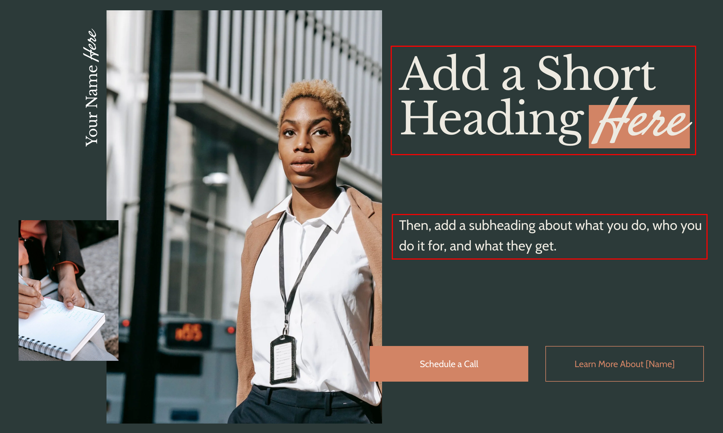
An effective hero section describes what you do, who you do it for, and what they get.
Here's an example:
Heading: Leadership Coaching for Executives Who Give a Damn Subheading: Our Leadership360 program guarantees results within six months.
What: leadership coaching. Who: executives (the ones who give a damn, specifically). What they get: results within six months. Done.
Compare that to the hero headings you see on a lot of expert sites — something like "Unlock Your Potential." Unlock whose potential? To do what? It's so general it could belong to a life coach, a locksmith, or a fortune cookie.
Pull up your homepage right now and read your hero heading and subheading. If a stranger couldn't answer all three questions in five seconds, it's time for a rewrite.
3. Add a Call-to-Action Button to Your Navigation
Whatever the first step in your sales process is — a free fit call, a discovery session, a demo — it should live in your navigation. And it shouldn't be just another text link sitting quietly next to "About" and "Contact."

Making your “Schedule a Call” link into a button using your accent color will help it catch your visitor’s eye.
Make it a button. Most Squarespace templates (and most other platforms) let you add one to your header in a couple of clicks. Use your main accent color so it stands out, and give it clear, action-oriented text like "Book a Free Call."
Why does this matter? Because your navigation follows visitors everywhere on your site. The moment someone decides they're ready — on your homepage, halfway through your About page, or three paragraphs into an offer page — the next step is right there waiting for them.
4. Then Add That Call-to-Action Everywhere Else, Too
Your navigation button is a great start. Now let's take it further.
Your visitors decide they're ready at different moments. Some are ready after your hero section. Some need to read every last testimonial. Some scroll all the way to the bottom before they're convinced. You want that next step to be visible whenever that moment hits, so nobody has to scroll back to the top hunting for it.
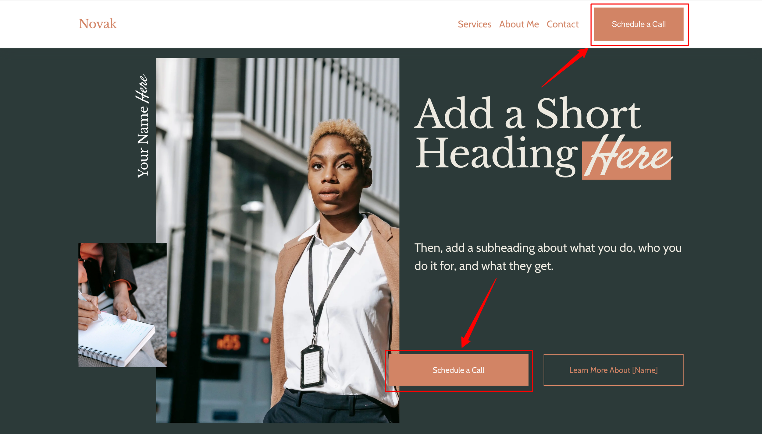
It’s very hard to over-do CTA buttons. Don’t be shy in adding them; your leads will be grateful and those who aren’t interested will skip right past them.
As a rule of thumb, put a call-to-action at nearly every scroll level of your page. That can look like:
A button in your hero section
A button following your offers or process section
A dedicated Call-to-Action section partway down the page — a short, inspiring headline and a button
One more right at the end, so nobody hits a dead end
"But David," you may be thinking, "won't that feel pushy?" Nope. It's really hard to overuse CTAs. Folks who aren't ready will scroll right past them, and folks who are ready will get exactly the nudge they need.
5. Give Your Buttons Better Words
Now that you've got buttons all over your site, let's talk about what they say.
"Submit." "Learn More." "Click Here." These are the defaults, and they're fine in the sense that they technically work. But they're boring, and they don't tell your visitor anything about what happens next.
Your button text is a tiny piece of copy that does a lot of work. Make it specific and action-oriented, and if you've got some personality, let it show:
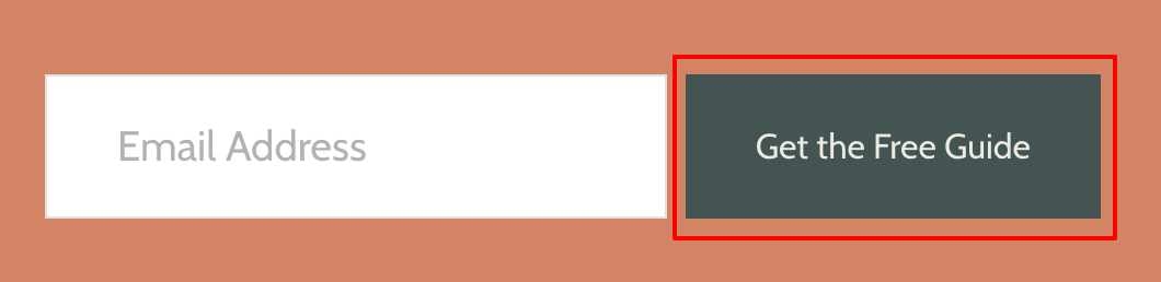
Use interesting button text that tells your visitors what will happen after they click.
Instead of "Submit": "Send My Message" or "Get My Free Guide"
Instead of "Learn More": "See Group Coaching Details"
Instead of "Click Here": "Book a Free Fit Call"
While you're at it, check your buttons for consistency: same shape, same size, same text style, roughly the same word count, and the same color (adjusting where needed for different backgrounds). When your buttons all look alike, visitors instantly recognize them as clickable — and clickable things get clicked.
6. In Addition to Your Contact Form, Add a Booking Scheduler
Contact forms are great for some things. Maybe a podcast host wants to have you on their show, or someone has a question about your offer before they're ready to talk. Keep that form.
But if a contact form is the only way to take the first step in your sales process, you're losing people.
Here's why: When someone fills out your contact form, they have to wait for you to read it, write back, and go through the "Does Tuesday work? How about Thursday?" back-and-forth. Meanwhile, the excitement they felt when they reached out fades. Momentum is lost.
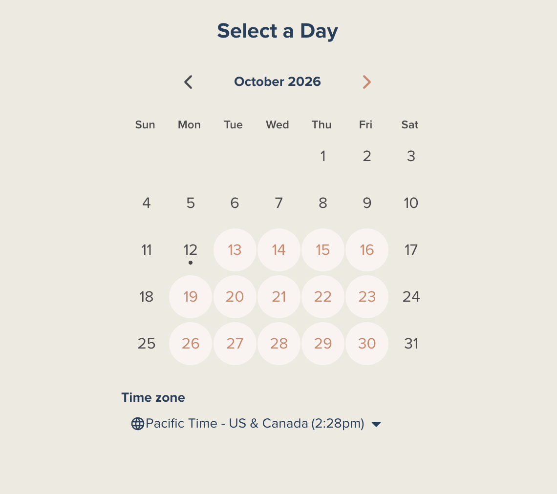
Tools like Calendly and Acuity Scheduling make managing bookings easy for you and your leads.
Compare that to a scheduling tool like Calendly or Acuity Scheduling. The exact moment your potential client decides they want to talk, they pick a time. They get a confirmation email with a calendar invite and details on what to expect — and they're already experiencing how organized and easy you are to work with.
So keep your contact form for general inquiries, add a scheduler for the folks who are ready to go, and point those buttons from #3 and #4 straight to it. (Bonus points: add a little reminder on your contact page that there's a more direct route if they're ready.)
7. Rewrite and Relocate Your Testimonials
Testimonials are one of the most powerful trust-building tools you have. They're also one of the most commonly squandered.
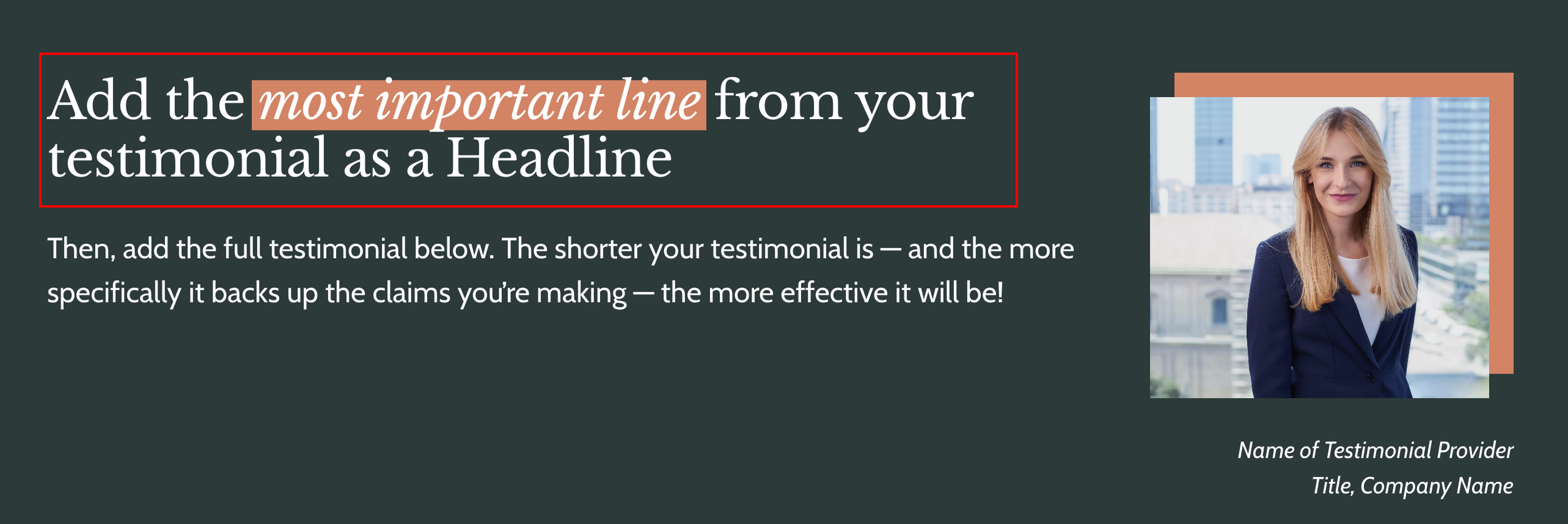
A good testimonial starts with the most important line as a heading; it’s also positioned so the context matches.
Rewrite them
When a client sends a glowing, paragraphs-long review, our instinct is to copy and paste the whole thing onto our website. The result is a big block of text nobody reads, with the best bits lost in the shuffle.
Instead, try this format: best bit as a headline, plus one to three supporting sentences.
Here's a real-world example, first in its original form:
"I am a CEO and leadership speaker and was looking for someone to help me better understand my business and offer. After dozens of interviews I found Theresa. WOW WOW WOW! Working with Theresa was an amazing experience from start to finish. What she does is joyful, purposeful magic! Her approach felt personalized to me, she was a great listener, and the process was even pretty fun. I got more clarity and value for my business in a few hours of co-creating with Theresa than I got over YEARS with other costly programs and partnerships."
And after:
"What Theresa does is joyful, purposeful magic!" "WOW WOW WOW! As a CEO and leadership speaker, I got more clarity and value for my business in a few hours of co-creating with Theresa than I got over YEARS with other costly programs and partnerships."
Same client, same praise, less than half the words — and now the best part actually gets read.
One important note: always get your client's permission before editing their testimonial. Most folks will be glad you asked (and happy to see their words looking so good).
Relocate them
Next, make sure each testimonial lives where it's most relevant. A testimonial about your keynote belongs on your Speaking page. A testimonial about your executive coaching belongs on your executive coaching page.
The more closely the person giving the testimonial matches the person reading it, the easier it is for the reader to picture themselves getting that same great result.
8. Put Your Body Text on a Diet
I cannot stress this enough: The less body text on your site, the better.
People don't read giant blocks of text on websites. They scan. So when your site tries to say everything, very little actually gets through.
Here's a simple rule: no more than three sentences per paragraph, and no more than three paragraphs per section.
Want to see what that looks like? This paragraph is exactly three sentences long. Not so bad, right?
Go through your pages one section at a time. For each paragraph, ask yourself: "Does my visitor need to know this to take the next step?" If not, cut it — save the deep details for your discovery call. Your website's job is just to get them there.
You Don't Always Need a Full Website Redesign
Sometimes a website really does need to be torn down and rebuilt. But a lot of the time, it doesn't. Small improvements add up, and together these eight can make your coaching or consulting website clearer, easier to navigate, and a whole lot better at turning visitors into clients.
So pick one. Knock it out this afternoon. Then pick another tomorrow, and watch your site start to shine (and work a lot harder for you).
And if you are building a new site from scratch? Launch It & Love It template kits are built on the Launch Framework, with every one of these best practices baked right in. They make it easy to build a beautiful, conversion-focused website in under a week — and launch a site you love.

Hi, I'm David!
I've poured my 20+ years professional web design experience into delivering Website Intensives and Website Template Kits designed to help thought leaders (coaches, consultants, professional speakers) get the website they've always wished they had.