Table of Contents
Like this post? Pin it!
There are industry buzzwords that get repeated so often they become almost meaningless — and “conversion optimized” is one of them. Web designers (including me!) put it on their websites next to “modern” and “mobile responsive” and other things that should be a given in 2026.
So when I say the website I build are conversion optimized, what do I actually mean?
Simply put, I want your website to work like an employee. Specifically, I want it to work like a salesperson who never sleeps, never takes a sick day, and never gets weird about asking for the sale. (I've written about this before as the seventh characteristic of a great website.)
You may say “well my website is acts as a salesperson” – but if your site isn’t converting, your website is less of a salesperson and more of a greeter. (Greeters are lovely people! But you're not trying to hire a greeter.)
First, let's define "conversion"
When most people hear "conversion," they think purchase. Somebody bought something. Hooray!
That's a conversion, but it's not the only one. A conversion is any moment where somebody's status with you changes:
Visitor → subscriber: they downloaded your guide, they're on your list
Subscriber → lead: they booked a call
Lead → client: the ultimate conversion
This matters more than it might seem. If the only thing you measure is sales, you'll look at your website and conclude it's failing — when in reality it's doing exactly what it's supposed to do, which is move people one step closer to you. Almost nobody lands on your homepage cold and immediately hands you money. They get to know you first.
So how do we actually get people to take those steps? It comes down to four things:
Your calls to action — what are you asking your audience to do?
Your copy — is it focused on the right person?
Your user interface (UI) — is it clear to people what to click?
Your friction — are you making this harder than it needs to be for your visitors?
1. Calls to Action: Inviting Your Audience to Take a Next Step
Every page on your website should have at least one next step. This is a rule I established in my book, The Launch Framework Handbook, and I’m pretty stubborn about it: no dead ends on your pages.
A few things I've learned about doing CTAs the right way:
Match the CTA to where the reader is in their journey. Somebody reading a blog post found you three minutes ago is considered “top of funnel.” They’re probably not going to book a call with you, but they might download a free resource and get on your email list. On the flip side, somebody who's read all the way through your offer page is considered “bottom of funnel” and may be ready for that call.
Two types of CTA per page, max. You can go with more, but I really advise against it. When you offer five different next steps, you're no longer a guide and instead are presenting a menu – and that can overwhelm your lead with analysis paralysis.
Repeat those two CTAs as often as you want. Same button in four places? Great! That's not clutter, that's convenience.
Maybe that last item makes you a little uncomfortable: "Won't it feel pushy?" No. Think of it this way: frequent CTAs are a favor to your audience. When somebody decides they're ready, they shouldn’t have to scroll back up hunting for the button. You're saving them work. And the folks who aren't ready will scroll right past without a second thought — they're very good at ignoring things.
2. Copy: Write to them, not about you
Your copy is doing a huge amount of the converting, and most sites get it wrong in the same way. Three rules I want to shout from the rooftops:
Your copy should sound like you. Not like a marketing brochure, not like the way you think a “Professional Website” is supposed to sound. Make it sound the way you do when a client is sitting in front of you – it’s a great way to show people what it’s like to work with you.
Your copy should mostly be about your ideal client. It’s your website and your business – shouldn’t you be writing about yourself? Not really. Your audience only cares about you insofar as you're relevant to solving their problem.
Your copy should name the stakes. Where is your audience now (before state)? Where they want to be (after state)? What's at risk if nothing changes?
I want to expand on that last point. Start by naming where your audience is right now: what they're struggling with, and — this is the important part — how that struggle feels. When you describe somebody's problem back to them better than they could describe it themselves, something clicks. This person gets me. If they understand me and my problem this well, they can probably solve it.
Then paint the other side of the picture. What does life look like once this is handled? That before-and-after gap is the whole reason somebody hires you. Your copy should make it visible.
(And when you do talk about yourself — which you should! — put it in the context of how you help your audience. As StoryBrand’s Donald Miller always says, you should position yourself as the guide, not the hero.)

Want help getting clear on who your website should be talking to? I created the Ideal Client Clarity Guide — a short workbook that walks you through the questions you need to answer about your ideal audience. You fill it out from their perspective, in their words. By the end you've got a reference doc that makes writing your homepage, About page, and offer pages dramatically easier — because you actually know who you're writing to.
It's free, it takes about 15–20 minutes, and the clarity you get will shape every piece of marketing copy you write from that point forward.
3. UI: Make the important stuff obvious
The User Interface (UI) of your site includes layout, colors, and visual hierarchy. Four things to get consider:
Pick a feature color and use it where you want people to look. Pick one bright or bold color and use it for the stuff you want clicked or looked at. If everything on your page is a bright color, your audience doesn’t know where to look and it all becomes a wash.
Keep buttons consistent. Use the same shape, size, text style, and color across the whole site. When buttons look alike, we recognize them as clickable. When buttons all look different, we’re not sure what to click.
Make sure it’s actually readable. Light gray text on a white background looks sleek in a screenshot but is unreadable for a big chunk of your visitors.
Then check it on your phone. As I mentioned earlier, a mobile-responsive site should be a given in 2026 when over half of folks are browsing on their phones.
And remember: your site isn't one long rambling document. It's a stack of sections, and each section has one job to do. That structure is what makes the whole thing scannable, and scannable is what makes it convertible. (That's the core of the whole Launch Framework. Here's a fuller explanation if you want it.)
4. Friction: Every extra step costs you
Friction is anything that makes engaging with your content take more effort than it needs to.
Here are some examples of friction you may have overlooked:
Too many form fields. Every field you add is another small reason to abandon the form. Name, email, subject, message is your default — add more only when you have a reason, like filtering out folks who aren't a fit.
Contact forms where a scheduler belongs. When somebody fills out a contact form, they have to wait. You read it, you reply, they reply, and somewhere in that gap the moment passes and the momentum dies. Compare that to a scheduler like Acuity or Calendly — the instant they decide they want to talk to you, they pick a time and it's done. You've captured them in the exact moment of deciding, which is the only moment that matters.
Confirmation messages instead of thank you pages. A "thanks, got it!" message is fine, but it's a full stop. A thank you page confirms the thing happened and offers another step — follow me on LinkedIn, grab this related resource, add the meeting to your calendar. These are the warmest people on your entire website. Give them somewhere to go next.
Clever navigation labels. Make sure someone who’s never heard of you can understand what you offer without having to guess or do more research.
Let’s talk about those navigation labels with an example: Let’s say a coach offers three levels of coaching, and her navigation reads:
QuickStart Coaching
NextLevel Coaching
BestSelf Coaching
She knows what those mean. Her current clients know what those mean. But a brand-new visitor has absolutely no idea, and now they have to click around and figure it out. That's a conversion you lost before anybody ever laid eyes on a CTA.
Now imagine the navigation said this instead:
Single Sessions
Group Coaching
Long-Term Coaching
Plain names let people find what they came for in one click instead of three. Prioritize clarity over cleverness and you’ll do right by your audience.
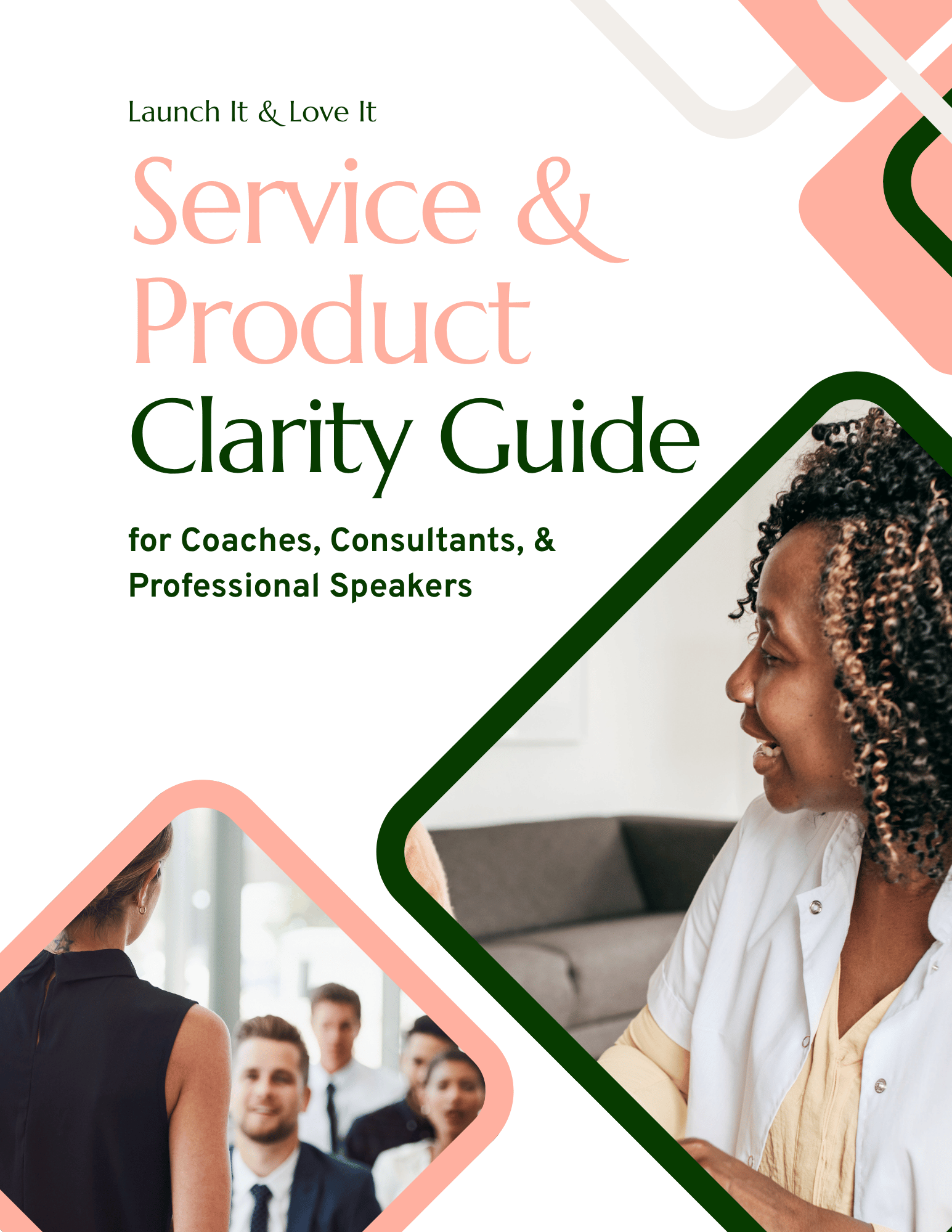
Looking for help clarifying your offers and processes? I created the Service and Product Clarity Guide — a short workbook that walks you through your offers so you can clearly convey them on your website. By the end you’ll have a reference doc you can use for your website and other marketing materials.
It's free, it takes about 15–20 minutes, and the clarity you get will shape every piece of marketing copy you write from that point forward.
What conversion optimization is NOT
There are a handful of things that conversion optimization is not that often get lumped in with it. So to be clear, conversion optimization is not:
SEO. SEO brings organic search traffic to your site.
Ads. Ads bring paid traffic to your site.
Social media or content marketing. Creates attention and brings people to your site.
Conversion optimization doesn’t bring more traffic to your site, it optimizes the experience once they’re there. But if you’re focusing on marketing instead of conversion optimization, you’re spending time and money on driving traffic to a site that won’t do anything for you (or your audience) once they arrive.
Your version is much simpler and much more achievable. Four questions:
Are my buttons visible and clearly defined?
Is the copy clear and about the my ideal audience?
Is there an obvious next step on every page?
Is anything making this harder than it needs to be?
Get those right and you're ahead of nearly every expert website out there.
This is baked into everything we build
Here's the thing about all of the above: it's not a layer you add at the end. You can't build a website and then sprinkle conversion optimization on top like parmesan cheese.
It's structural. It's the reason the Launch Framework organizes sites into five core pages and eight repeatable sections in the first place — because when every page has a clear objective and every section has a job, the next step is never a mystery to your visitor.
That's true of every site that comes out of Launch It & Love It:
Our DIY template kits are built on these principles, so when you drop your own copy in, the structure is already doing the heavy lifting for you.
Our custom Website Intensives run on the exact same logic — same framework, just with me in the driver's seat.
Same principles either way.
If you want the whole system — the pages, the sections, the elements, and how they fit together — it's all in The Launch Framework Handbook. You can grab a copy here.
And yes, that link you just read was a call to action. It was relevant to what you were reading, it appeared at the exact moment you'd finished the argument for it, and it asked you plainly to do one specific thing.
See? It's not that complicated.

Hi, I'm David!
I've poured my 20+ years professional web design experience into delivering Website Intensives and Website Template Kits designed to help thought leaders (coaches, consultants, professional speakers) get the website they've always wished they had.