The 8 Things I Look for on Every Expert Website (and Why They Matter)
Most expert websites don't fail in a big, dramatic way. The sites are fine: The design is nice, nothing's broken, the photos represent you well. Instead, they fail quietly: People show up, they look around for a few minutes, and then they leave without doing anything at all.
This type of failure is hard to quantify, because you usually never hear about it. Nobody emails to say, "I was considering hiring you, but I couldn't figure out which of your programs was for me." They just close the tab and go find someone else whose website made it easier. (you’ve probably closed plenty of those tabs yourself.)
Lately I've been running expert websites against a scorecard I created, which is really a website checklist of eight things I look at on every coaching, consulting, and speaking site. If you received one of those scorecards from me, this post is the longer version — it walks through what each row means and why it's there.
And if you didn't receive one, don't worry. There's a quick version at the end you can run on your own site.
First, What I Mean by "Conversion"
"Conversion" gets thrown around a lot in the world of marketing and websites, so let's actually define it.
A conversion is any moment a visitor goes from browsing your site to engaging with you. On an expert website, that usually looks like:
Booking a call
Joining your email list
Downloading a free resource
Sending you a message through your contact form
Notice that a sale isn't on that list. For most coaches, consultants, and speakers, the sale happens later — on a call, in a proposal, or over Zoom. Your website's job is to get the right people to that next step. (If you'd like the longer version, I wrote a whole post on what "conversion optimized" actually means.)
Every Visitor Arrives with Questions
Every person who lands on your site shows up with questions: Am I in the right place? Can I trust this person? Can they really help me?
Each question your site leaves unanswered is a reason to hesitate. And hesitation on a website usually looks like someone leaving.
The eight things on my scorecard are really just eight of those questions, along with the part of your site that answers each one:
A clear opening answers Am I in the right place?
Problem and/or solution answers Do you understand where I am, or where I want to be?
Painting the outcome answers What will actually change for me?
Your offers answers What do you sell, and which one is for me?
Showing the process answers What happens if I say yes?
Proof & credibility answers Why should I believe you?
A clear next step answers What do I do now?
The pages you need answers Can I find what I'm looking for?
When your site answers all of them, you've cleared the path to the next step. When it leaves one or two unanswered, that's usually where your conversions are leaking.
Let's go through them one at a time.
1. A Clear Opening
Am I in the right place?
What it is: Your opening is the first thing someone sees when they land on a page, before they scroll. (Web designers call this the hero section.) It's usually made up of a headline, a subheading, a button, and an image.
Why it matters: A first-time visitor decides super quickly whether to stick around. If they can't tell they're in the right place, they often won't scroll far enough to find out — which means everything you carefully wrote further down the page never gets read.
How to make it great:
Name what you do, who you help, and what they get in plain language. Clever is fine, as long as clarity comes first. A career coach might open with "Career coaching for mid-career professionals who are ready for what's next."
Let the subheading fill in whatever the headline left out. Between the two, a visitor should have a clear picture of what you do, who it's for, and what they get.
Tell people where your button goes. "Book a free call" (linking to your Booking page) works beautifully, and so does "Get to know me" (linking to your About page) A button that just says "Learn more" leaves the visitor guessing.
Watch for headlines that could belong to anyone. It can be tempting to lead with your own name, or with an inspiring tagline like "Unlock Your Potential." Both of these tell a visitor something about you without telling them whether they're in the right place.
2. Problem and/or Solution
Do you understand where I am, or where I want to be?
What it is: This is a section that describes your reader's situation back to them. It can come at it from either direction: the problem they're stuck in (their current state), or the place they're hoping to get to (their desired after state). The "and/or" matters here — you don't have to do both, and sometimes one direction is all a page needs.
Why it matters: Have you ever had someone describe your problem better than you could describe it yourself? It's like magic. Your first thought is this person gets me, and right behind it comes if they understand me this well, they can probably help.
That's exactly the reaction you want from a visitor, and it's one of the fastest ways to build trust on a website.
How to make it great.
Use your reader's words, not your methodology's. Stay away from jargon or overly technical language. If you’re not sure what words your audience uses, customer interviews can help immensely here.
Name how the situation feels, not just what's happening. "Missing quarterly targets" is a fact, but it misses out on how that feels. "Dreading Monday's leadership meeting" is something a reader recognizes in their gut.
Don't go too dark. Some will say you need to extrapolate all the worst-case scenarios that could arise if your audience doesn’t fix their problem. I disagree: If you describe the problem, keep it short and turn toward something more hopeful soon after. Dwelling on pain tends to overwhelm people more than it motivates them.
3. Painting the Outcome
What will actually change for me?
What it is: A quick snapshot of life after working with you. It's usually three or four short headings, each describing a change your client gets to experience or a feeling that results from those changes..
Why it matters: People don't really want coaching or consulting or a keynote. They want the results that come from those things. When a visitor can picture themselves in that after state, the decision to take the next step gets a whole lot easier for them.
How to make it great:
Choose concrete over abstract. Telling visitors they’ll achieve “success” is nice, but too broad. What does success look like? How does it feel?
Describe changes in your client's life, not features of your program. "Six biweekly sessions" is a feature – not what we’re looking for here. Instead, paint a picture of the change: for example, "Walk into your next performance review with a plan".
Make it something your audience can picture. A career coach who promises "clarity about your next move" is hard to argue with, which is exactly the problem. "A job offer you're genuinely excited to accept" is something a reader can picture — and want.
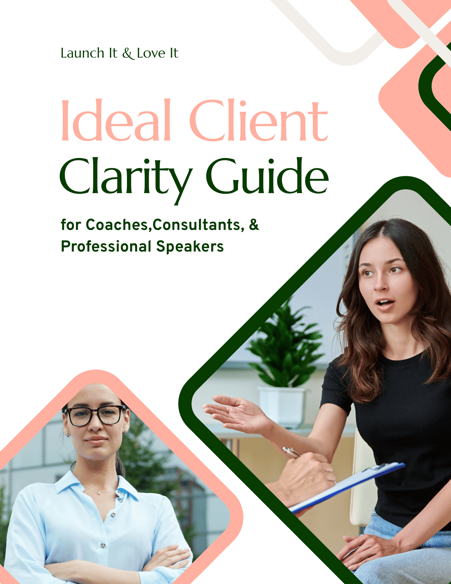
Want help getting clear on who your website should be talking to? I created the Ideal Client Clarity Guide — a short workbook that walks you through the questions you need to answer about your ideal audience. You fill it out from their perspective, in their words. By the end you've got a reference doc that makes writing your homepage, About page, and offer pages dramatically easier — because you actually know who you're writing to.
It's free, it takes about 15–20 minutes, and the clarity you get will shape every piece of marketing copy you write from that point forward.
4. Your Offers
What do you sell, and which one is for me?
What it is: An overview of the ways you help, usually on your homepage. Each offer gets a name, a line or two of description, and a link to learn more.
Why it matters: Your audience probably isn't one person. An event professional looking for a keynote speaker and an executive looking for one-on-one coaching might land on the very same homepage, and each of them needs to find their path quickly.
How to make it great.
Name your offers in plain language. Your current clients may know that "NextLevel Coaching" is your group program, but a first-time visitor has no idea. "Group Coaching" does the job instantly. (I dig into this more in The 7 Characteristics of a Great Website.)
Give each one a line of detail. This is just enough for someone to recognize which offer is theirs, without overwhelming them with a wall of text.
Put your offers on the page, not only in your menu. A visitor shouldn't have to open your navigation to find your offers.
Combine offers that are very similar. If two offers serve the same people, deliver similar results, and follow a similar process, consider presenting them together so your reader can compare them in one place.
5. Showing the Process
What happens if I say yes?
What it is: A short sequence — ideally just three steps — showing how you take someone from where they are now to where they want to be.
Why it matters: Hiring an expert is a leap, especially at a higher price point. A clear process shrinks that leap into a few small, manageable steps, and it answers one of the biggest unspoken questions a visitor has: what am I actually signing up for?
It also shows you have a plan. If you went to a specialist and they asked, "Well, what would you like us to do?" you'd probably start looking for a different specialist. Your audience feels the same way.
This section one I most commonly see overlooked, because your process feels obvious to you. But it isn’t obvious to someone meeting you for the first time, and even if it can be reasonably assumed, it’s better to state it explicitly.
How to make it great:
Keep it to about three steps. Your real process might have 12 or 20 or 30 steps, and that's fine — your website just isn't the place to list them all. A customer experience consultant's process section might look like this:
Book a free twenty-minute call
Get a custom CX plan for your team
Watch your CSAT (Customer Satisfaction) scores rise
Make each step something that happens, not a value. A process that goes "Discover, Transform, Thrive" sounds nice, but it doesn't tell anyone what their first week looks like.
Make step one low-commitment. A free call or a short assessment is a much easier first yes than a six-month contract.
Put it where it'll be seen. If there's one main way people work with you, your homepage is the place for it. If you offer genuinely different services (say, one-on-one coaching and keynote speaking), each offer page can carry its own process instead.
6. Proof & Credibility
Why should I believe you?
What it is: Evidence that you're as good as you say you are. This could be testimonials, metrics, logos from past clients or events, or media like a speaker reel or a podcast appearance.
Why it matters: Anyone can say they're great. Proof lets someone else say it for you, which can come across as much more trustworthy.
How to make it great:
Choose relevant proof. The more a testimonial's author resembles your reader, the easier it is for that reader to imagine getting the same result. For example: Keynote testimonials belong on your speaking page, and coaching testimonials belong on your coaching page.
Go for specifics. "Diane was great!" is lovely to hear and does very little for a stranger. A real result does so much more.
Make testimonials easy to read. People rarely read a whole paragraph-long testimonial, and the best stuff often gets lost in the middle. Pull out the single best line and use it as a headline, then trim the rest down to a few supporting sentences.
Use logos your audience recognizes, even if nobody else would. A credit at a respected industry conference can carry more weight with your people than a household name.
Bring proof to where decisions happen. If your best testimonials live on a separate page, your audience has to take the extra step of seeking them out. Instead, integrate them directly on your homepage and offer pages.
7. A Clear Next Step
What do I do now?
What it is: A dedicated section that invites your reader to do one specific thing. It's usually a short headline and a button, sometimes a form.
Why it matters: There should be no dead ends on your website – someone reaching the end of the page should always be presented with a next step. These sections are the moments a conversion actually happens. If you’re afraid of coming across as pushy or salesy, just reframe it: “I’m inviting them to take a next step. Not forcing them.”
How to make it great:
Write button copy that says what happens when they click. "Book your free call" beats "Submit" or "Click here" every time.
Give the headline some warmth. "You can do this. I can help." does a lot more than "Contact me."
Match the ask to the reader who's reached it. Someone who's scrolled all the way to the bottom of your homepage is further along than someone who just arrived. A newsletter signup is a great invitation, but it's worth adding a warmer one alongside it — like booking a call — for the people who are closer to ready.
Don't worry about overdoing it. It's hard to have too many invitations on your site. Visitors who aren't interested will scroll right past, and the ones who are will appreciate not having to go searching around for it.
Remember your thank-you pages. When someone fills out a form, send them to a page that confirms their action was successful and thanks them – but don’t stop there. Consider inviting them to follow you on your social channels or sign up for your newsletter, download a resource, or even schedule a call with you – these are warm visitors, after all.
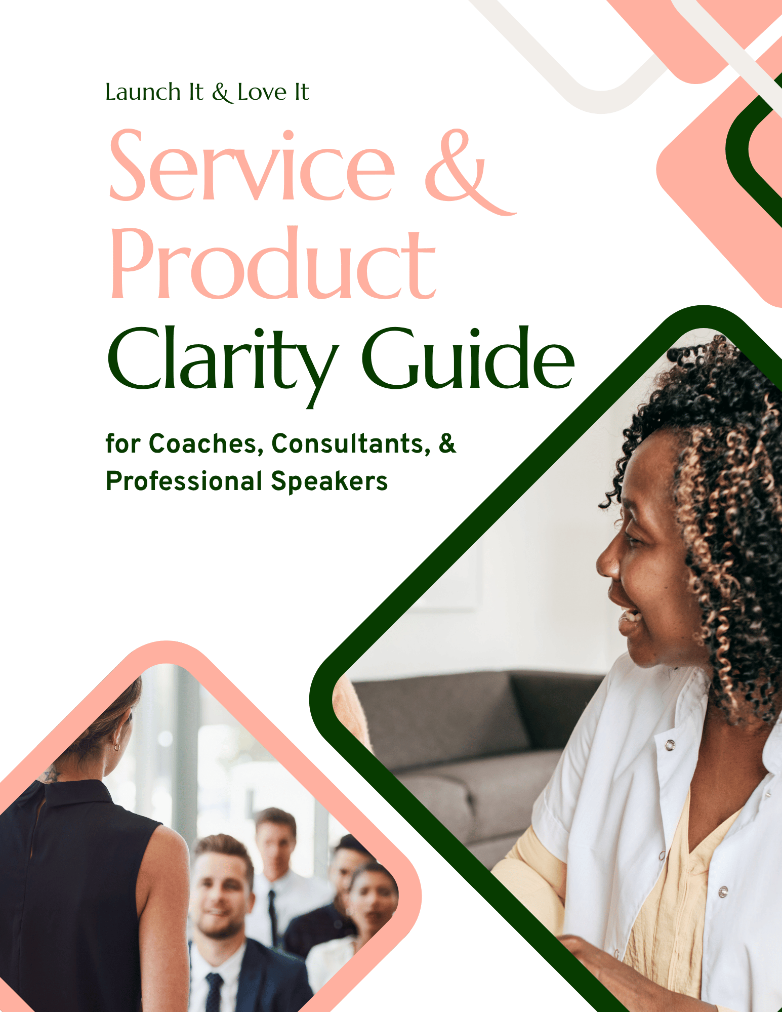
Looking for help clarifying your offers and processes? I created the Service and Product Clarity Guide — a short workbook that walks you through your offers so you can clearly convey them on your website. By the end you’ll have a reference doc you can use for your website and other marketing materials.
It's free, it takes about 15–20 minutes, and the clarity you get will shape every piece of marketing copy you write from that point forward.
8. The Pages You Need
Can I find what I'm looking for?
What it is: This one zooms out from a single page to your whole site. Every coaching, consulting, or speaking website needs five core pages:
Home
About Me
Offer(s)
Contact
Booking
(You can read more about these pages in my post, The Only Five Pages an Expert Website Needs.)
Why it matters: Home, About, and Offers tend to get built first, because they're the pages we think of as "the website." Contact and Booking are easier to put off but often among the most important, because they're the pages where a ready visitor actually says yes. When someone who's ready to act can't find the door, they leave.
How to make it great.
Make all five reachable from your menu in one click. Don’t make people hunt to find what’s relevant to them.
Treat Booking and Contact as separate jobs. A contact form means someone has to wait for your reply, while a scheduling tool on a booking page lets a ready visitor lock in a time while they're still excited. Your Contact page is for everything else: podcast invitations, questions, and folks who aren't quite ready yet.
Don't stress about a long menu. A navigation section with five links isn't a problem. A navigation missing the one link someone needs is.
What's Not on the List: Visual Design
You might notice there's nothing on the scorecard about colors, fonts, or photography.
That's not because design doesn't matter. It does, and a polished, consistent look builds trust all on its own. (If you want some simple guidelines, there's a whole appendix on it in The Launch Framework Handbook.)
It's just that design is where most of us already put our energy (I've watched people spend a week choosing a shade of teal). It's also the most subjective part of any website, since two people can look at the same color palette and have opposite reactions.
The eight things on this list are about structure and words: whether your site answers the questions visitors arrive with. That's where conversions tend to leak quietly, even on beautiful sites.
Think of it like a home inspection. The inspector isn't there to weigh in on your throw pillows. They're checking the foundation and the wiring, because those are the things that cause problems you won't notice until something goes wrong.
How to Read Your Scorecard
If you received a scorecard from me, here are a few notes on how it works:
Each item gets one of three labels. Working means that part of your site is doing its job. Could be stronger means the pieces are there but they aren't pulling their full weight. Not there yet usually means something is missing, or hard for a visitor to find.
There's no overall score on purpose. Your website isn't a test, and a single number wouldn't tell you what to do next. Think of the items as a map rather than a grade.
I name one gap, not five. A long list of problems is overwhelming, and overwhelm is the opposite of what you need. I pick the one I think is costing you the most, so you know where to start.
The fix is something you can do this week. It's meant to be a real change you can make yourself, without hiring anyone or rebuilding anything.
And a quick note on Not there yet: it's not a judgment on you or your business. It's simply the spot where a little attention will go the furthest.
Run This Website Checklist on Your Own Site
Didn't get a scorecard? You can still check your site against the same eight questions. Pull up your homepage, pretend you've never heard of yourself (harder than it sounds), and ask:
Could a stranger tell who this site is for within five seconds?
Does the page describe my reader's situation, where they are or where they want to be, in words they'd actually use?
Could a reader picture what changes for them after working with me?
Are my offers named plainly enough that someone can tell which one is theirs?
Can a visitor see what happens after they say yes, in a few simple steps?
Is there specific, relevant proof on the page itself, not a click away?
Does the page invite the reader to take a clear next step, with a button that says what happens?
Can someone reach my Home, About, Offers, Contact, and Booking pages from the menu in one click?
If you answered "not really" to one or two, that's your starting point. Just one, to begin with.
You Don't Need a Perfect Score
If you read through this list and spotted a few gaps on your own site, that’s not just okay, it’s normal. None of it means your website needs to be torn down and rebuilt.
Here's what I'd love for you to take away: conversion isn't a trick, and it isn't reserved for marketers with big budgets and fancy software. It's answering the questions your visitors already have, in an order that makes sense, and then inviting them to take the next step.
Usually one or two spots are doing most of the damage. Find yours and start there. Your website doesn't have to be perfect to work hard for you — it just has to stop leaving your visitors with unanswered questions.
(And remember, your website isn't written in stone. Anything you change this week can be changed again next month.)
Want me to run a scorecard report on your website? Contact me and I'll take a look.
Or if you'd rather talk it through, I offer a free twenty-minute call. There's no obligation, and I'm happy to simply answer questions.
Hi, I'm David!
I've poured my 20+ years professional web design experience into delivering Website Intensives and Website Template Kits designed to help thought leaders (coaches, consultants, professional speakers) get the website they've always wished they had.